Steam Library Redesign

case study
.
ui/ux

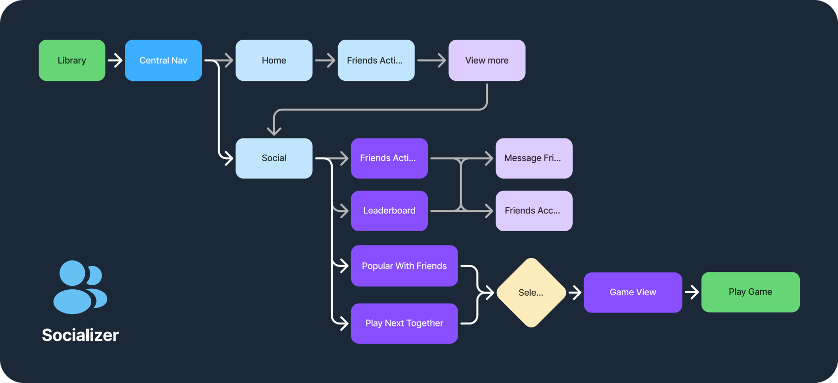
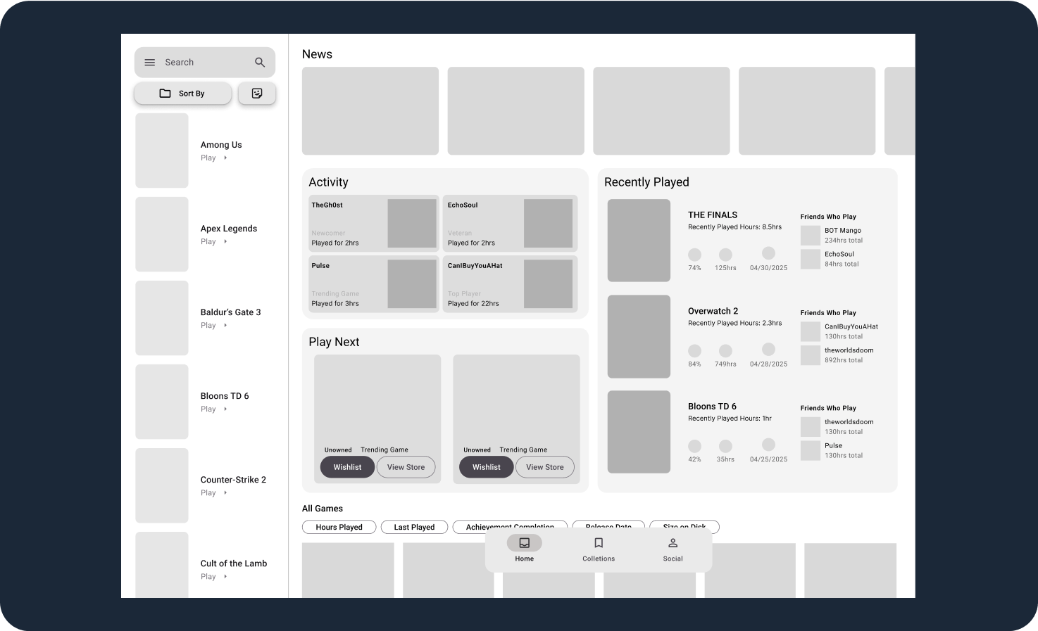
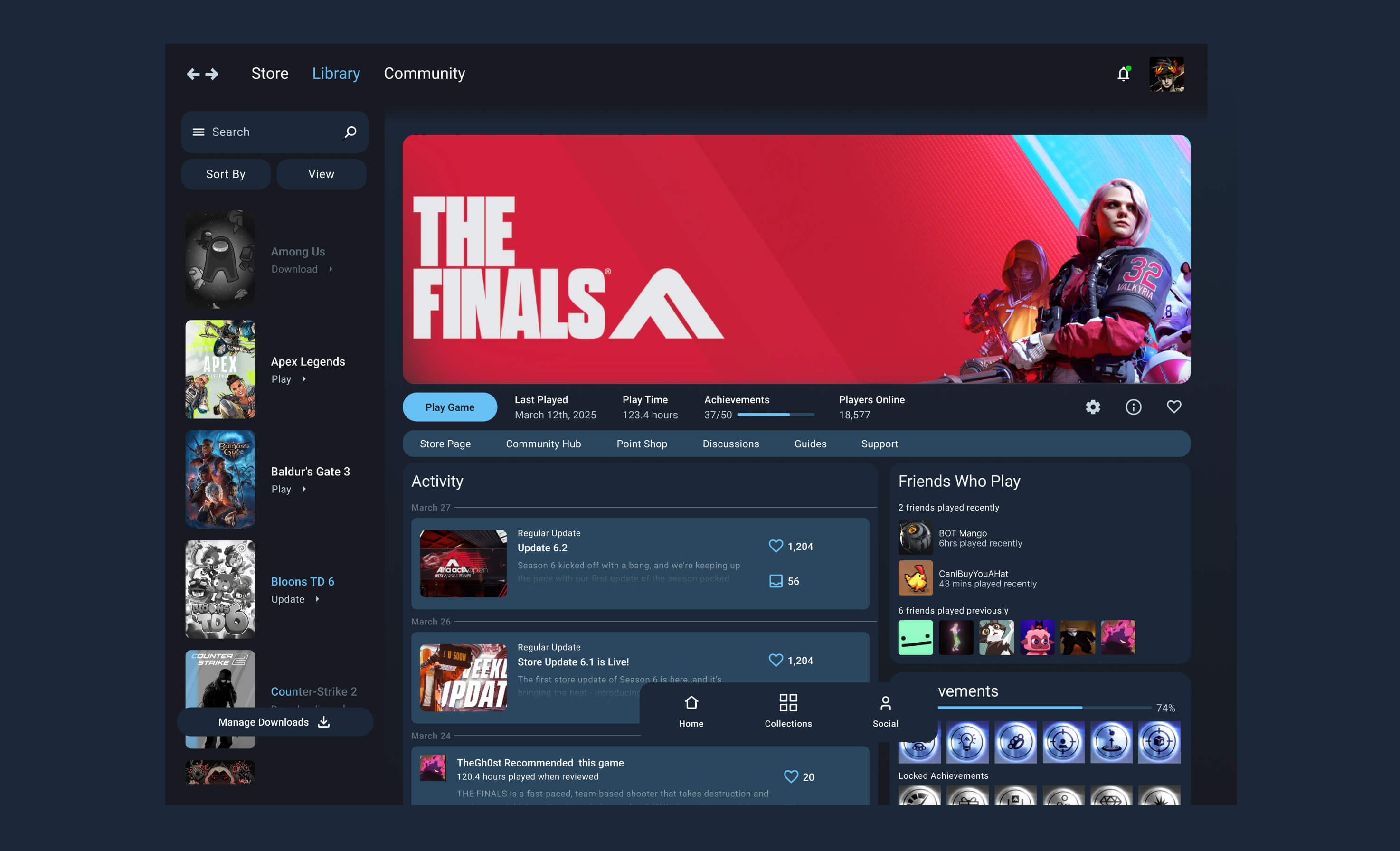
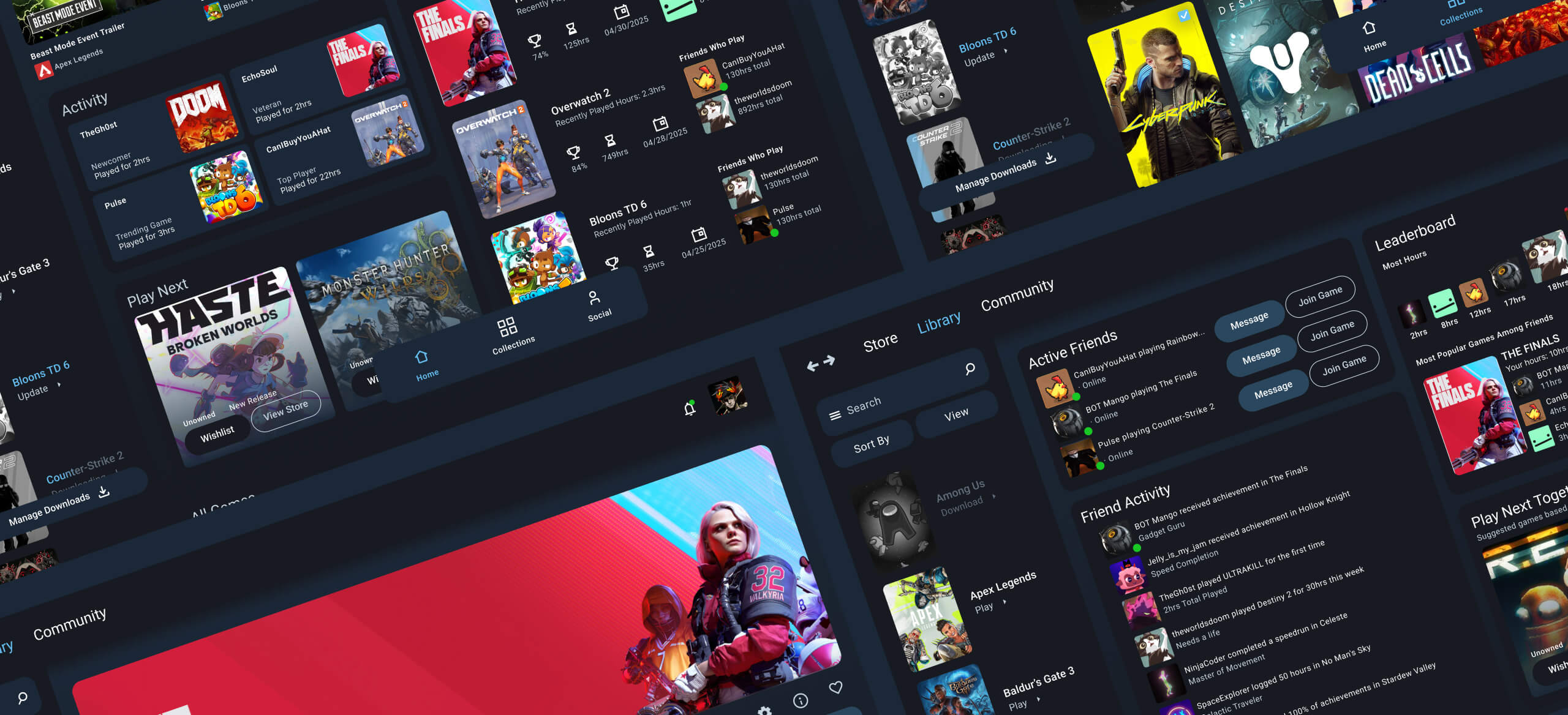
Steam is an industry-leading service hosting a variety of games and software. Users have a massive game library that has become hard to navigate. Providing new ways for users to access their games, socialize, and create collections.

Understanding

First, knowing how Steam currently functions was vital. How their design system works. With this testing users on their habits within Steam to identify pain points. By testing 6 users I was able to find how they access their games.

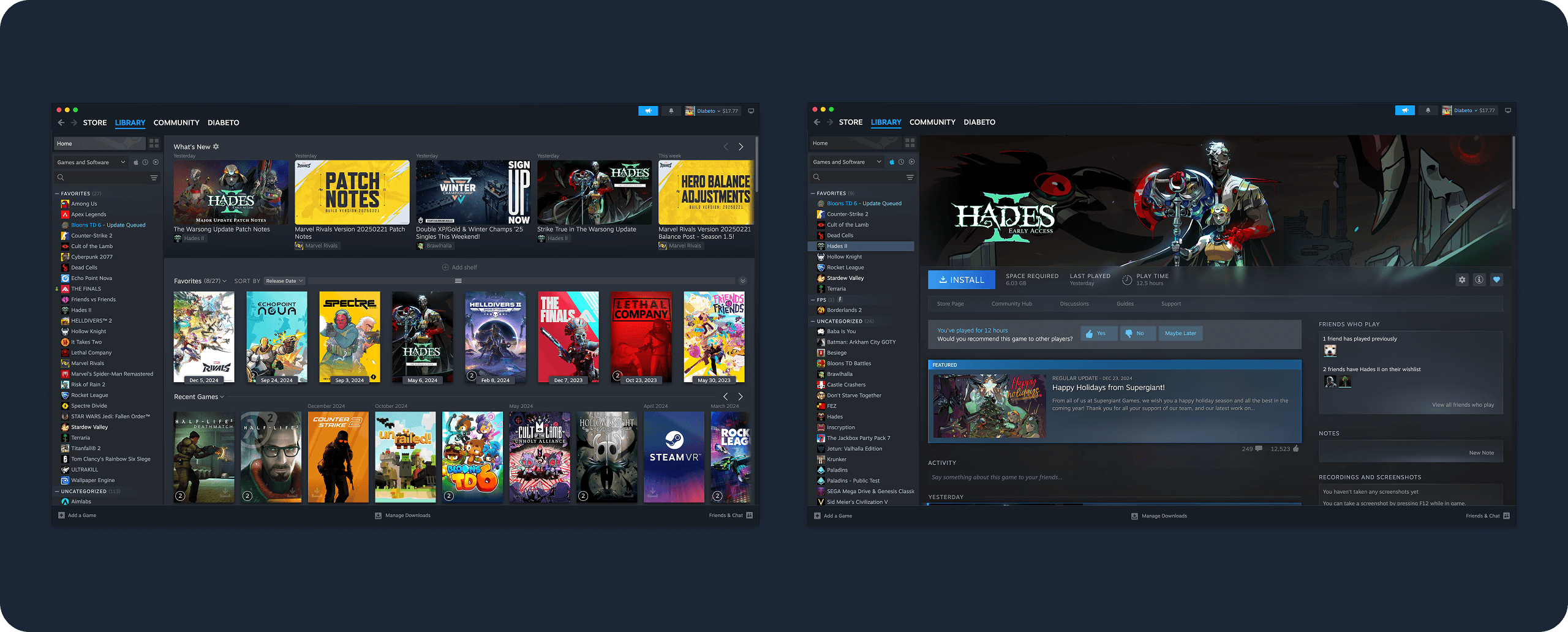
Users rarely organized their games, and they all developed unique ways of finding their games.

Planning

After user testing and interviews I developed three personas. Each has unique needs when using Steam. This allowed me to focus on separate flows addressing pain points for each user.
While each user has a unique way of accessing their games, they all have a simple goal: to play their favorite games.

Wireframing

Once my plan was developed, I dived headfirst into wireframing, finding any gaps I had glanced over during research and planning. This phase was experimental, determining what new methods I could create to address users' pain points.

New Ways To Explore

Separating the navigation to the left and central nav clarifies content for all users. The left nav has new ways to view games. The central nav has three core pages that users can easily access.

Simplified Collections

Users opted out of collections due to a lack of interest. Making collections a part of the central nav and stripping the function to its core purpose and organizing your games. With an updated search feature, users can quickly find games to add to their collections.

More Than a Launcher

Users seek stronger social features within Steam. A new social tab allows users to see what their friends are up to. Users also want to find a new game to play with others. When selecting a game, users will be familiar with how content is presented. All users want to launch their games easily, so keeping this function familiar was vital.

Final Testing

Revisiting the users previously tested, they navigated to the exact locations in the new UI. Users picked up quickly on the new UI. The app was familiar yet refreshing for users. Users preferred how collections were implemented. Accessing their games couldn’t be any easier.
“The redesign was able to give me a better view of everything at a glance”
“I was able to get more information in less time”
view prototype
view prototype